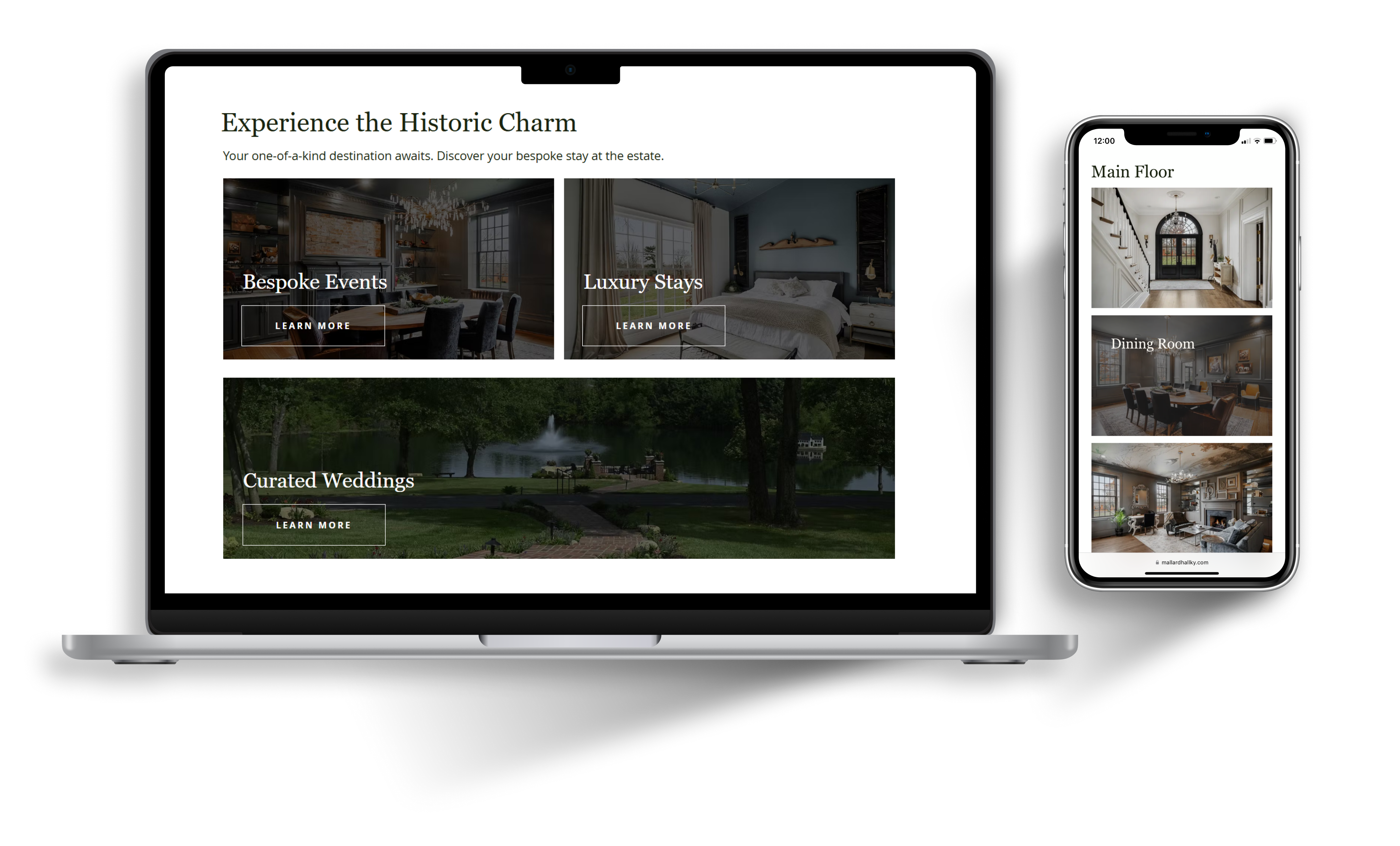
From first launch to measurable growth
Mallard Hall Estate was entering the luxury rental market with a renovated property, a folder of photographs, and a history dating back to 1790. I created its initial brand and website from the ground up, then returned a year later to evaluate how the it was performing and redesign it around real user behavior and business needs.
Time Frame
2 years
Services
Logo Design / Website Design / UX Design / Research / Copy Writing
Client
Mallard Hall Estate
Growth came from more than the website ...
That is for sure. But What the data did provide was a clearer picture of how the business was growing and how people were finding it.
#1
Google ranking for “Mallard Hall” and “Mallard Hall Estate”
50K
organic search impressions
57%
increase in event inquiries
20%
decrease in bounce rate
4x
increase in form submissions through organic search
The website became a source of new connections and leads, particularly through the contact forms.
×
![]()
01 — Establishing the Identity
How do you bridge history and modernity within one brand identity?
Mallard Hall had history, but no established digital identity. Before designing the website, I needed to create a visual language that could communicate the character of the estate while positioning it as a refined destination for events and stays.
Qualities That Guided the Identity
Historic
The visuals needed to honor the age and character of the home.
Natural
The surrounding landscape and pond were important parts of the property's identity.
Elegant
The brand needed to feel elevated without becoming overly formal or disconnected from the property.
The final logo designs
The design we landed on utilizes tapered flowing lines, which gives a soft and natural feel. To balance the rustic motifs, I used simple and clean silhouettes, breaking that up with some irregularity in the path of the outer circle. The font has a vintage feel, hinting at the history of the home.



02 — Defining the Experience
The website had two jobs: attract visitors and convert them into inquiries.
Mallard Hall was entering a competitive rental market without an established niche. I looked at both the competitive landscape and the people most likely to visit the site to understand what the exactly the website needed to accomplish.
Who are the competitors?
While the job of Mallard Hall's website was not the same as Vrbo and Airbnb, I wanted to understand how they were positioning other properties (what information was available, what decriptive language they used, if they highlighted certain features, etc.).
Sotheby's
Vrbo
Airbnb
Luxury Rentals Louisville
These sites provide a more objective view of properties. Mallard Hall's website is an opportunity to tell a story and connect with visitors on a more personal level.
Who is the website for?
Working with the client, I identified the characteristics and motivations of the audiences most likely to inquire. I translated those conversations into a persona, empathy map, and journey map to understand what visitors would need from discovery through inquiry.
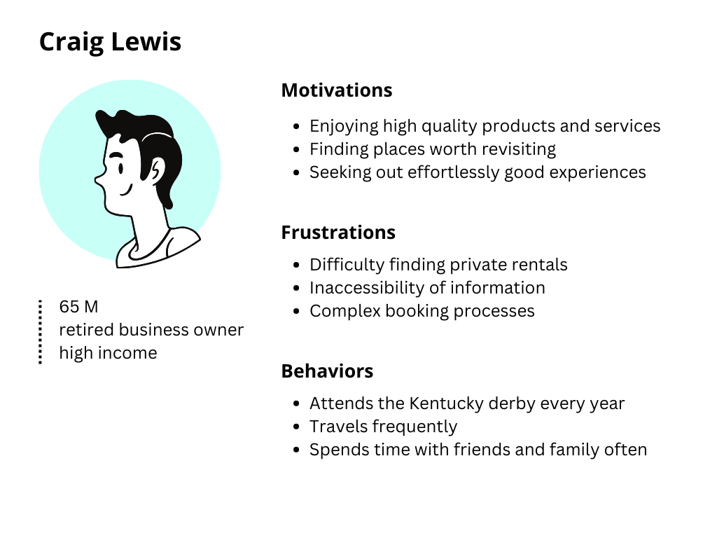
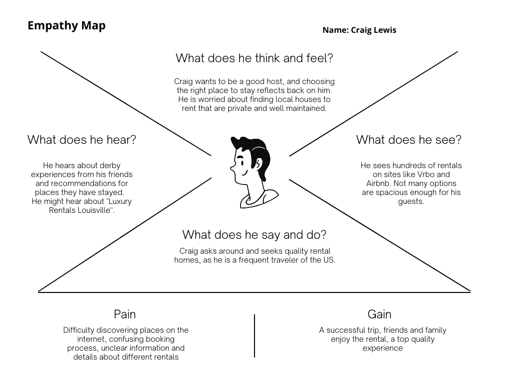
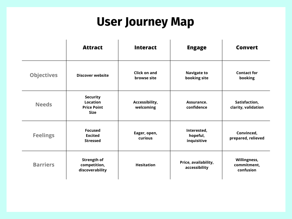
In order to attract, engage, and convert visitors, the website would need to be discoverable, desirable, accessible, and actionable.
03 — Creating the First Experience
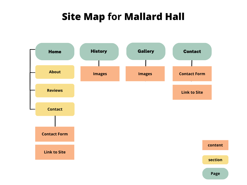
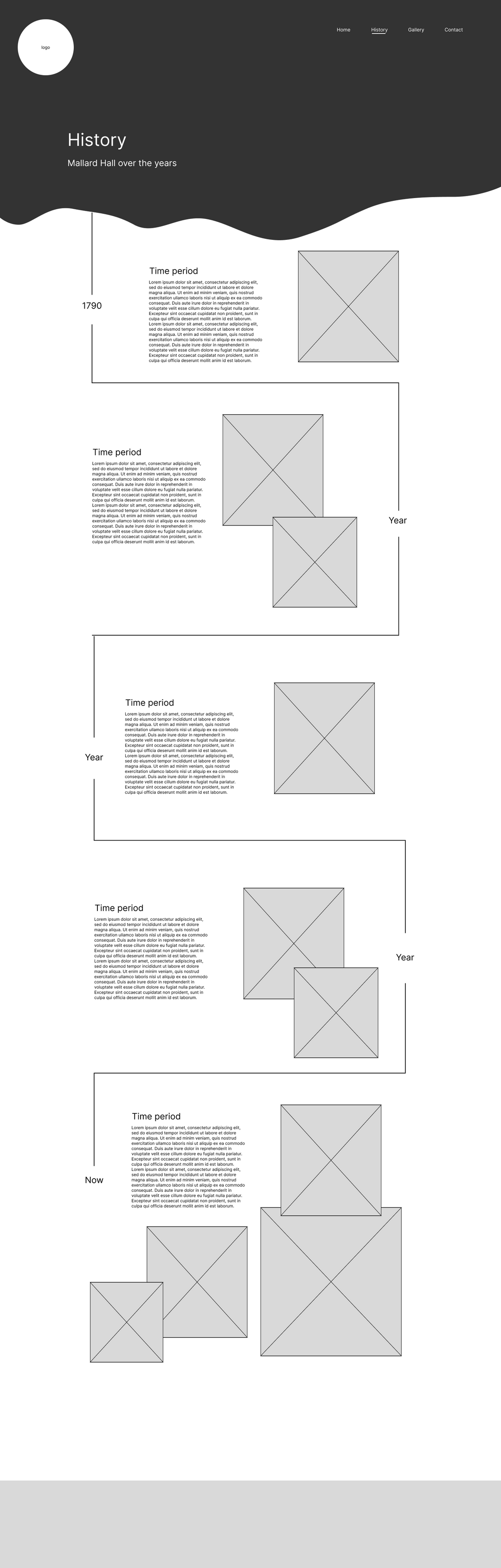
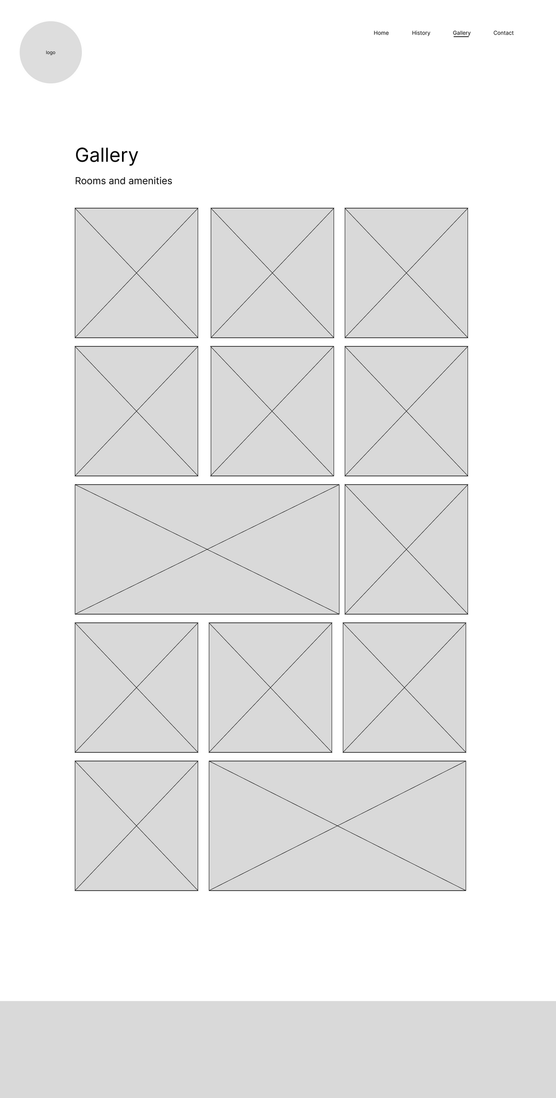
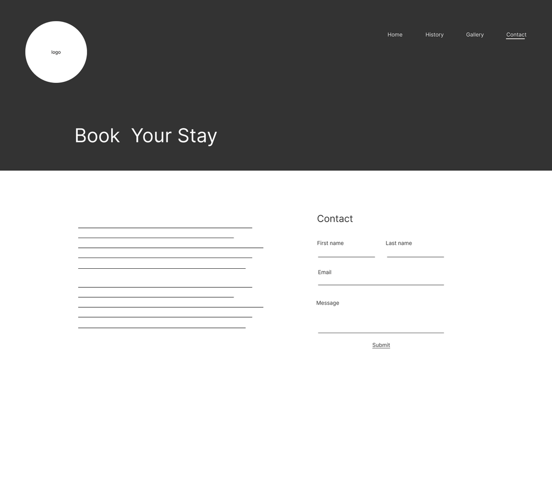
Four pages became the foundation.
Because this was the first digital touchpoint, I kept the navigation intentionally small and concentrated important information on the homepage rather than making visitors hunt through a large site structure.
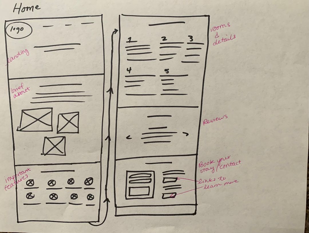
Home
Introduce the property and guide visitors toward deeper exploration.
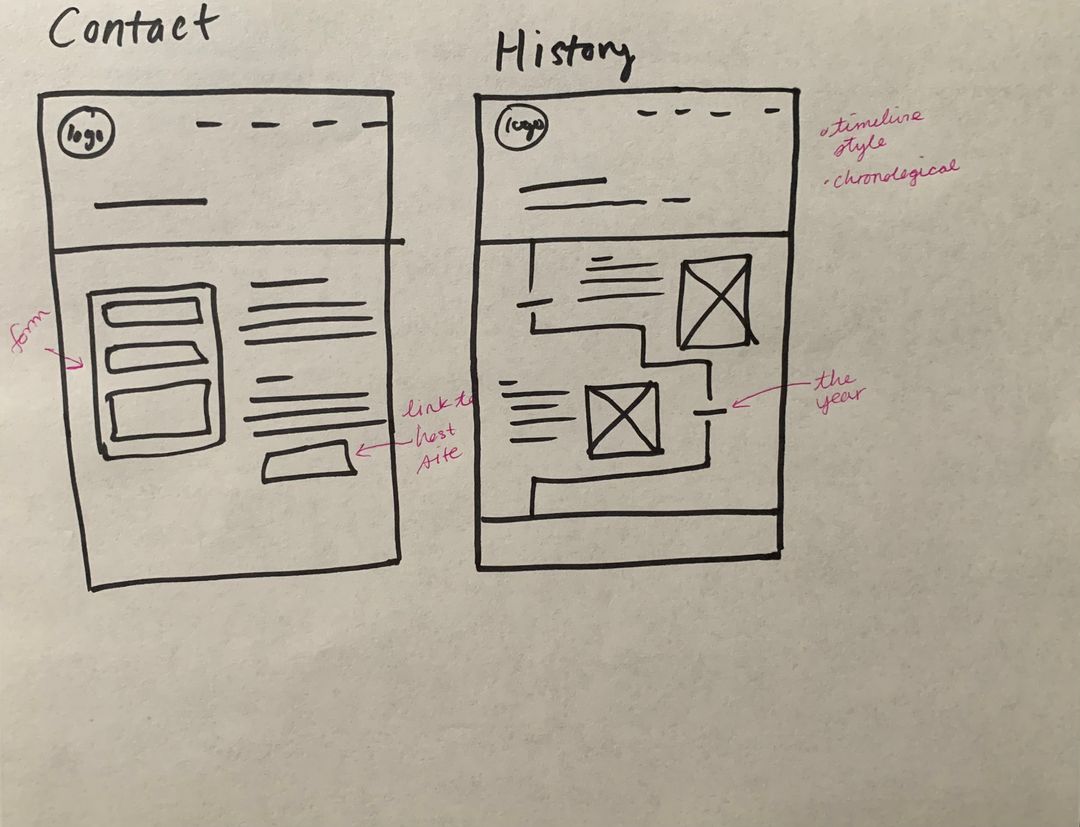
History
Build an emotional connection through the story of the estate.
Gallery
Let visitors experience the property visually and understand its spaces.
Contact
Turn interest into an inquiry.
04 — Launching the MVP
From a folder of photos to a functioning digital presence.
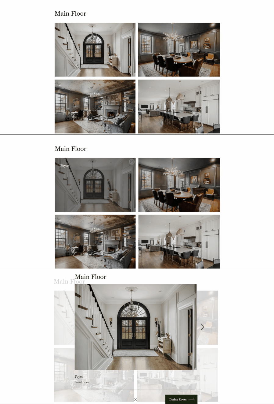
With the brand direction, audience, and information architecture established, I built the first version of the site in Wix. The MVP focused on introducing the estate, communicating its character, showcasing the property, and providing a straightforward path to inquiry.
Home

Gallery

Contact

The first iteration gave Mallard Hall a digital presence it could use to enter the rental market, and more importantly, gave us real insights into visitor behavior.
05 — One Year Later
The launch gave us something preliminary research couldn't: real behavior.
The first version of the site had established Mallard Hall online. But after a year of real traffic, I could look beyond assumptions and see how visitors were actually using it.
Three key findings changed the direction of the redesign.
Mobile was primary
Approximately 75% of visitors were using mobile devices.
→ Consider mobile first
Search was an important entry point
Google organic search was the site's second-largest traffic source, making content structure and SEO part of discovery.
→ Improve SEO practices
Too many competing paths
A 15-page content audit revealed inconsistencies in content, navigation, metadata, headings, and accessibility. The homepage prioritized quantity over guidance while important pages were obscured by the main navigation.
→ Streamline the architecture
Looking again at the competition
I investigated three local competitor websites and one stylistic reference to understand how established properties were guiding visitors through their sites.
Ashbourne Farms
Hermitage Farm
Gaffney House
Biltmore
Strong Patterns
- Clear CTA in navbar
- logo on the left
- Our Story/About
- Home page hero with CTA
- simple navigation
- social proof on homepage
- offerings showcased on homepage
Opportunities
- unclear end goal
- cluttered homepages
Though these websites have different user end goals, they implement similar navbar strategies and home page designs to steer the path of the visitor.
Rather than copying these approaches, the goal was to use them selectively for Mallard Hall's goals.
Auditing the experience
To understand the current state of the website, I audited each of the 15 pages across three main areas.
Content
Was each page giving visitors enough useful information?
SEO
Could search engines understand and surface the content consistently?
Accessibility
Could visitors access the experience regardless of device or ability?
The audit surfaced issues ranging from thin content and unclear navigation to inconsistent metadata, heading structure, missing alt text, and mobile usability problems. Together, they made it harder for discoverability and visitor conversion.

A guiding question: What are users trying to achieve by visiting the site?
Rethinking the architecture
The original site structure was built around the property itself. The redesign was built around the visitor's questions and intent.
With the research and findings in mind, I set out to redesign the website with a focus on streamlining the user experience and improving SEO practices.
Site Map Before

Site Map After

The new structure grouped related content under clearer parent pages, reduced competing choices, and created more direct pathways to the information most likely to influence an inquiry.
Four changes made the experience more intentional
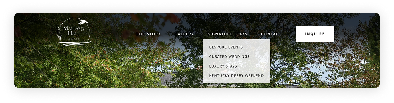
Surface the primary action
Added CTA button to navbar to highlight the shortest path to the desired outcome
Streamline the navigation
Reduced and reorganized the navigation to highlight crucial customer touchpoints
Improve language
Replaced generic language with more specific and engaging terminology to create a story that connects with visitors
Group related content
Placed related pages under cleared parent categories to streamline pathways
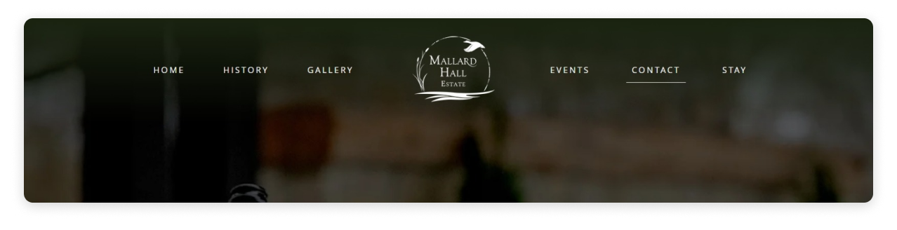
A clearer path starts with the navigation
The navigation is the core touchpoint of the website, making it an opportunity to continuously guide the visitor's next step. The redesign reduces competing choices, makes the primary inquiry action visible, and highlights pages that answer the most important questions a visitor may have.
Before
After
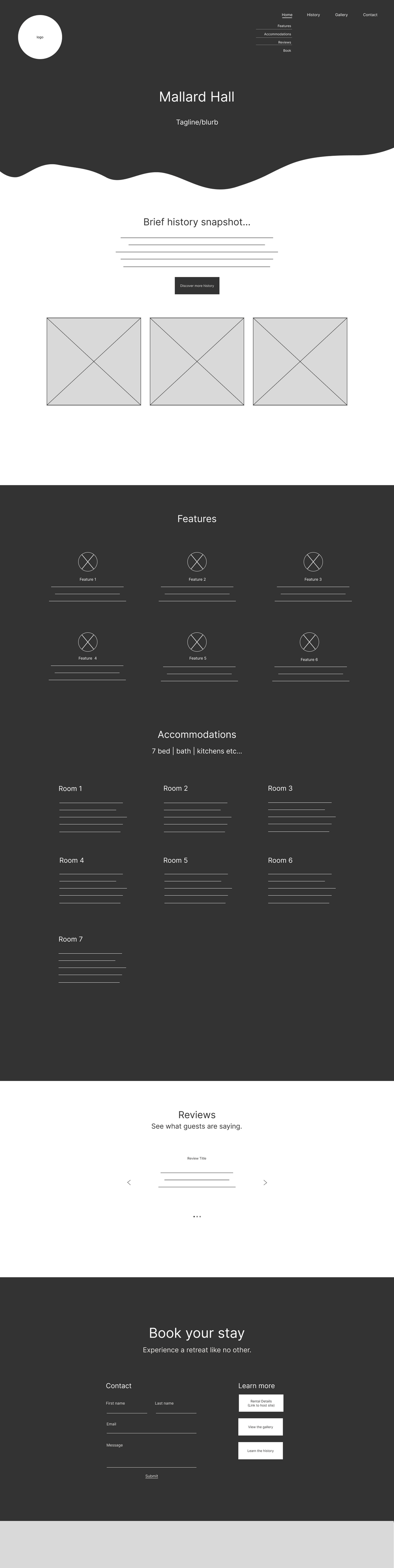
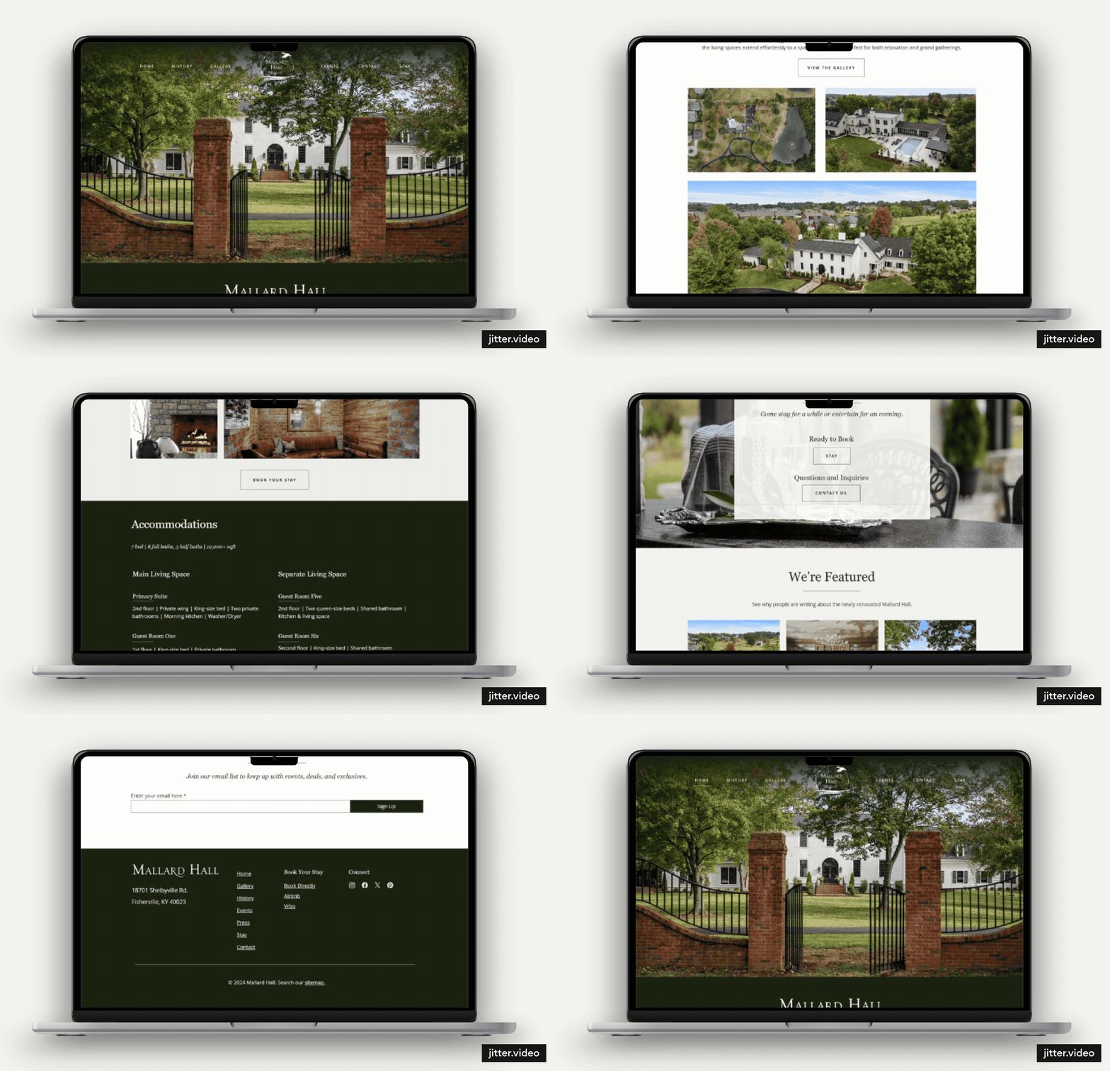
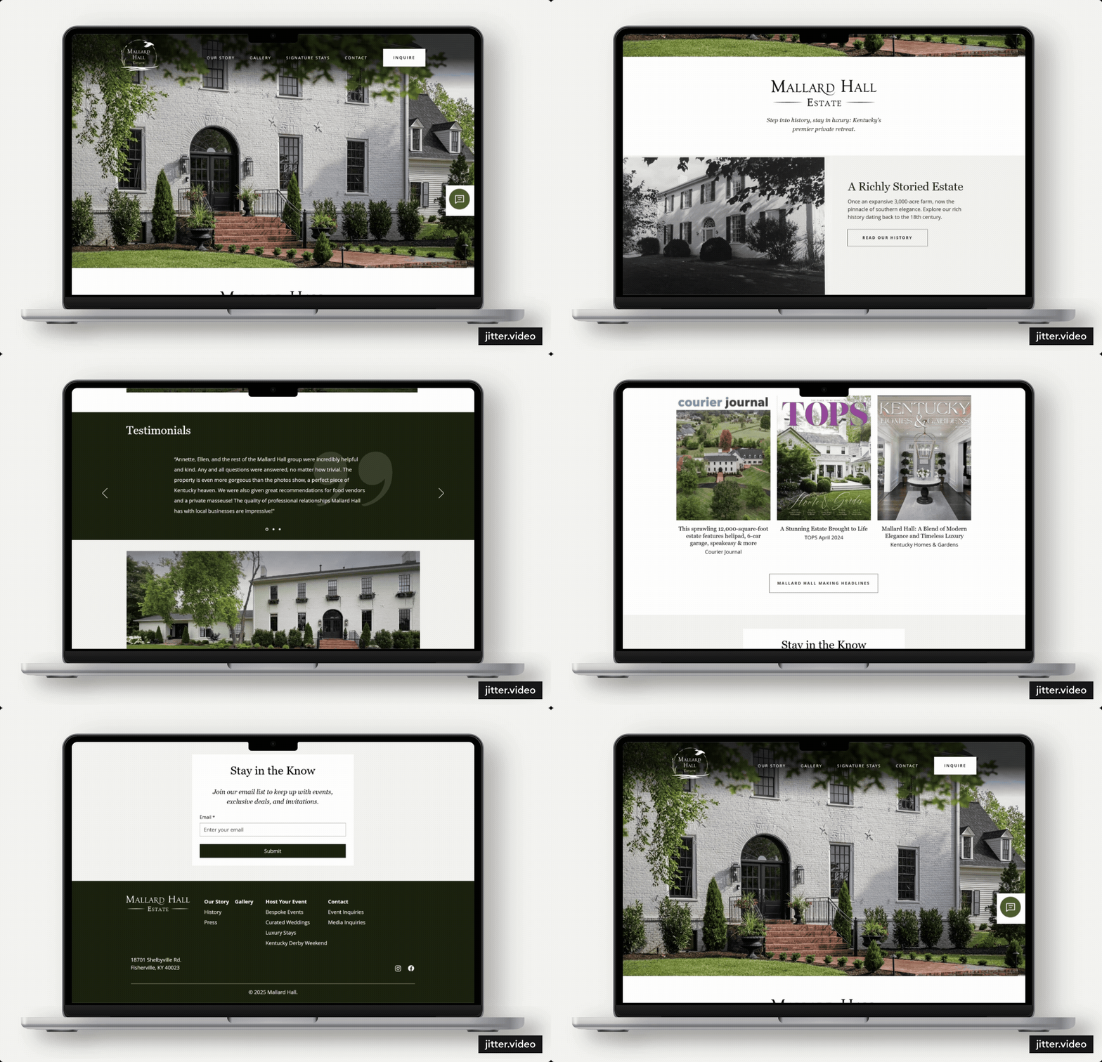
A Home Page that prioritizes quality over quantity
The long scrolling homepage is reduced to its most important elements rather than providing a taste of everything. The goal was to reduce cognitive load in order to make pathways clearer.
Welcome
Explore
Choose
Trust
Before
After
More pathways to conversion
The original experience treated contact as a single destination. The redesign created more specific pathways based on why someone was contacting Mallard Hall. A form for each event type provides a structured experience, helps keep things organized on the receiving end, bolsters SEO, and organic search visibility.
Weddings
Short Stays
Private Events
Kentucky Derby Weekend

Not every visitor has the same question
Event-specific forms provide the primary conversion path, but visitors with broader questions still need easy ways to reach the business. The redesigned experience therefore supports multiple channels for contact.


Lessons Learned
The website has grown and expanded since its (and the business's) initial launch. One thing I learned was that a website doesn't become successful when it launches, but when you continue learning from how people use it. It is a living and breathing artifact that requires governance to help it evolve and grow with the business.
Future Considerations:
Accessibility Checks
Assess the accessibility of each page, particularly how the history and gallery pages will be responsive to mobile
User Testing
Conduct usability tests to discover blockers, common touchpoints and pathways.
More Content and Pages
Grow the website's content to reach a wider audience.