How might we improve the usability of a robust university website while balancing stakeholder needs and dev constraints?
Our team was provided with low-fidelity wireframes and a robust amount of content to pour into each of the websites pages. With the constraints of our website authoring tool and usability at the forefront of our efforts, our goal was to translate this scaffolding into something impactful for our client.
Team
Sophia Straub, Emily Paterson, Noah Veenstra, Andrew Nguyen, Alison Hagen
Services
UX Design / Website Building
Client
Msu Finance
Impacts
Reduced Cognitive Load
for users of the website
Improved Navigability
by reducing clicks when possible
Increased Accessibility
through improved readability
Focus #1
Streamlining the Sitemap

We worked with client-provided scaffolding to get started. The challenge was adapting the existing content and pages to fit it. We could funnel existing pages into this site architecture when necessary:
Merging Subpages into One
This helped to bolster the content on sparse pages
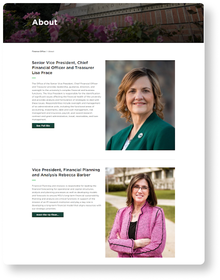
At first, we had two separate pages for Lisa Frace (CFO) and Rebecca Barber (VP), plus two additional pages that directed to their full bios.
To streamline this section, we decided to merge the two wireframes provided onto one “About” page that then could direct to their individual pages.
Focus #2
Reducing Redirects and Cognitive Load
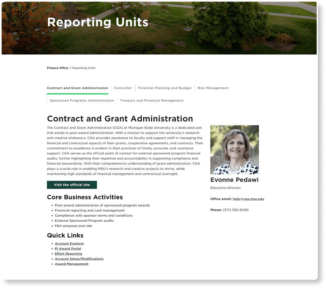
With a suite of organizational components, we opted for an accessible tab widget to toggle different information on the same page.
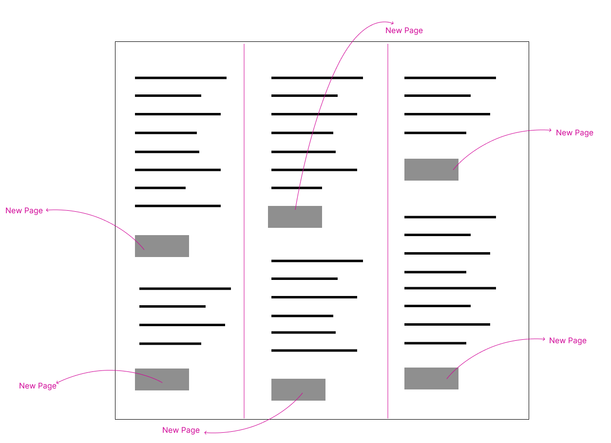
Before we had their Canva wireframe, this site page was organized into three columns for six units. Each unit redirected to its own individual page.
We then realized their preference for a tab format to represent each unit and streamlined from six pages down to one.
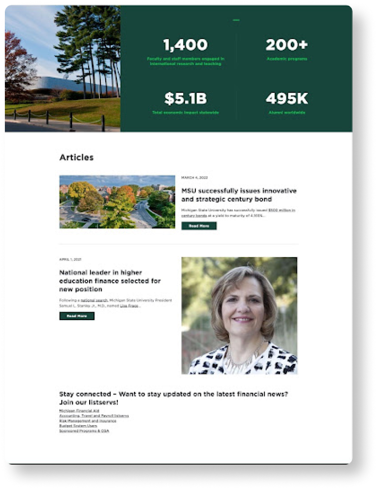
Chunking Content for Quick Readability
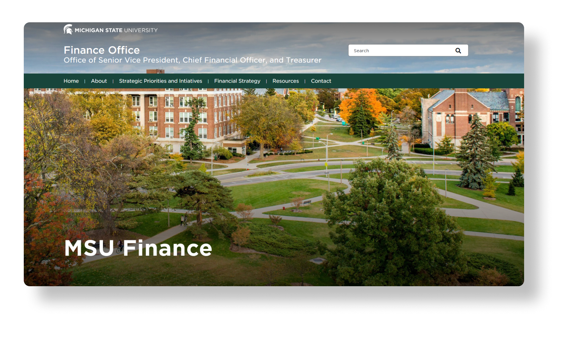
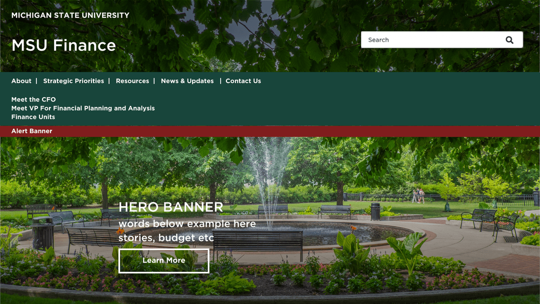
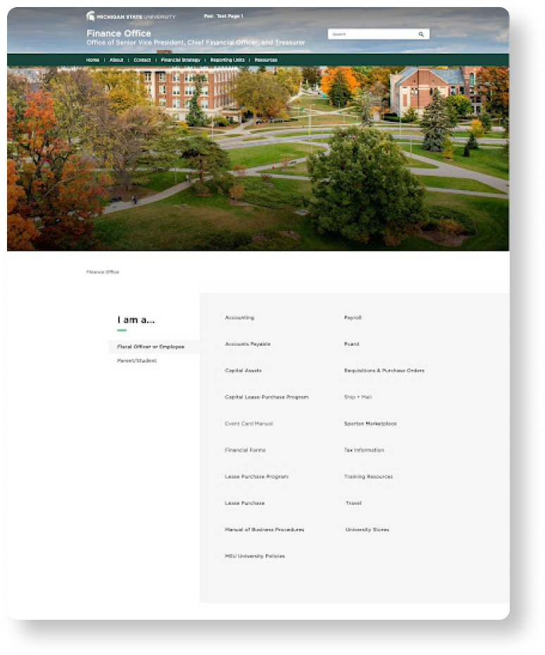
Originally, the home page looked a bit different in the client’s Canva document. Through different iterations and conversations with the client, we landed on a layout that more dynamically used content types to make scrolling and digesting information easier and more enjoyable.
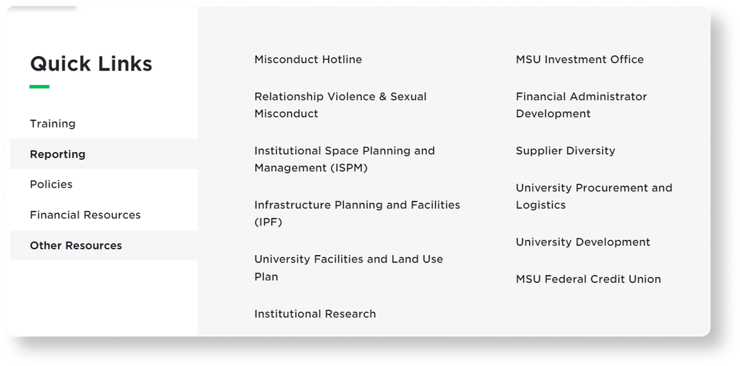
Reformatting Long Lists
Before access to Canva mockups, we were unsure how to structure the page. We copied and pasted links from content document provided, resulting in a long scroll of hyperlinks.
After access to Canva mockups, we knew to implement a side tab content type and organize links by group nested within each tab.
Focus #3
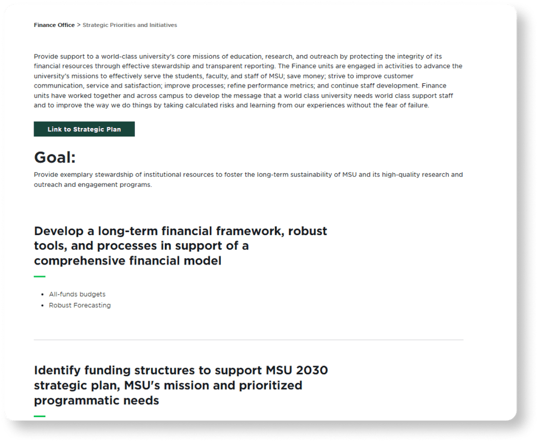
Establishing Visual Hierarchy in the Copy
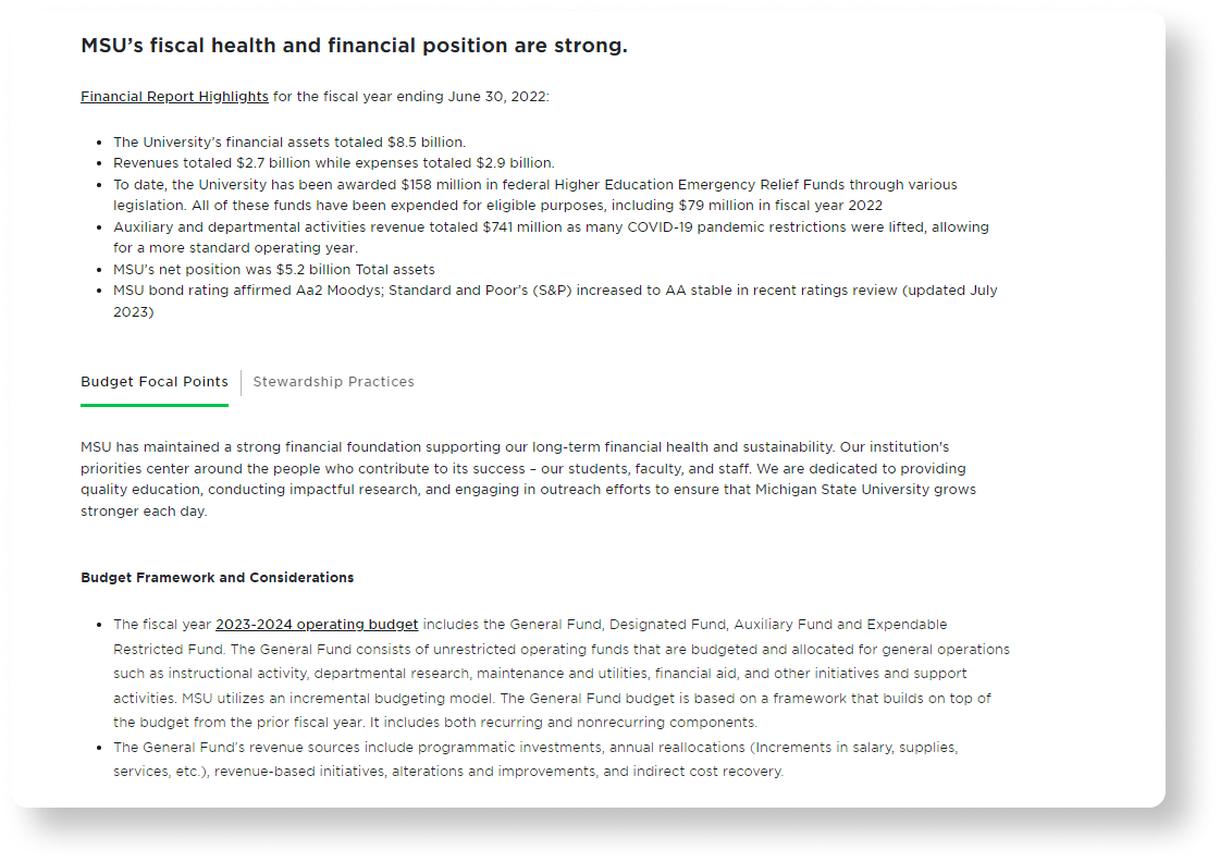
Priorities and initiatives of MSU Finance are streamlined into bullet points and sub points for optimal readability. The link to the strategic plan is easy to identify.
Improving Readability of the Financial Strategy Page
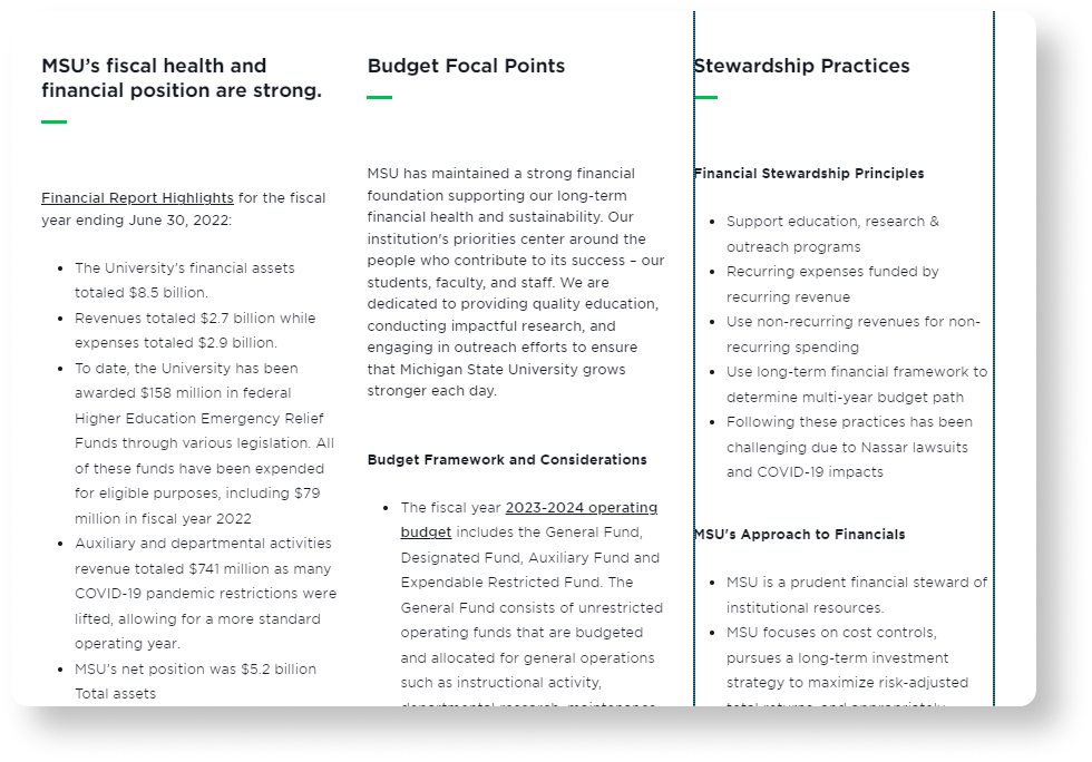
Original Design
- The text in each column is squeezed
- Chunky flow
- Aesthetic issues
Our Redesign
- Content from columns now takes up more width with tab design
- One of three points is highlighted as main
- Toggle between tabs to focus on other two
Takeaways
Balancing client wants and usability best practices can be challenging, especially within the constraints of an authoring tool with specific components. Clear and frequent communication is crucial in order to create deliverables that truly satisfy your clients and justify your design decisions.