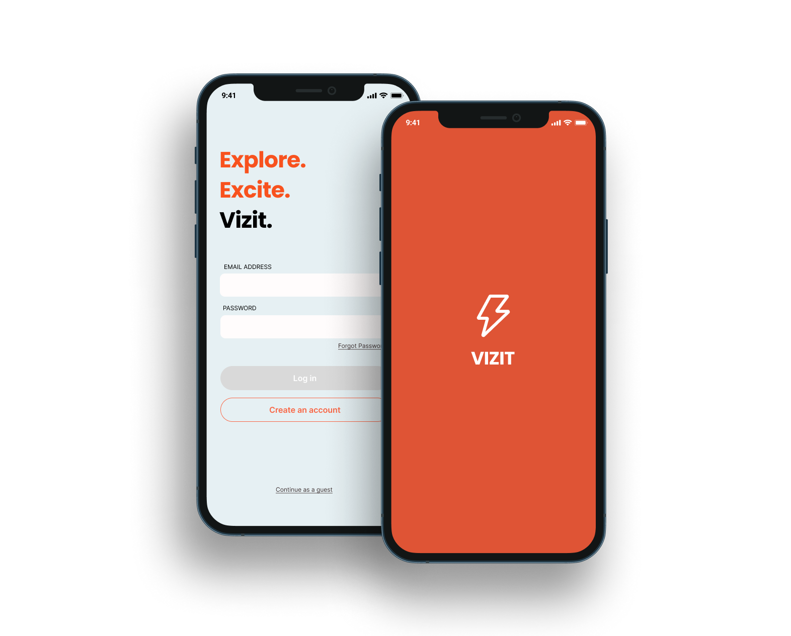
How might we concept an app with the user end goal of sparking unexpected joy?
Wellesley college's annual designathon challenge to design a prototype of a mobile app, including research, ideating, developing problem statements, wireframing, and prototyping.
Time Frame
40 hours
Prompt
Spark joy through sponteneity
Team
Sophia Straub, Bonnie Chen, Victoria Liang, Michelle Swolfs
Judging Criteria
Audience, Creativity, Design, Strategy, Delivery
Results
3rd Place Overall
chosen from 11 teams across the nation
Strong Concept
with business and user goals in mind
Agile Workflow
with team members in different time-zones and with different strengths
Focus #1
Ideation and Discovery for Solutions to the Prompt
How might we create a prototype for an app that sparks joy through sponteneity, meeting the judging criteria?
- ☐ Grocery list generator
- ☑ Itinerary randomizer for solo travelers
- ☐ Mindfulness activities generator
Research and Discovery
After conducting loosely structured research, we would then be able to specify our problem space and begin designing solutions.
Interviewing Peers
User Profile
Occupation: any
Age: ideally 20-30
Location: United States
Structure
- Informal
- Relatively unstructured
- Qualitative
- 10 questions (demographics, decision making, solo travel)
Objectives
- ► Gage current behaviors (do they travel solo?)
- ► Reveal outlook on solo outings
- ► Understand current frustrations
- ► Discover interest in spontaneity
Focus #2
Synthesizing Our Findings and Understanding Our Target Audience
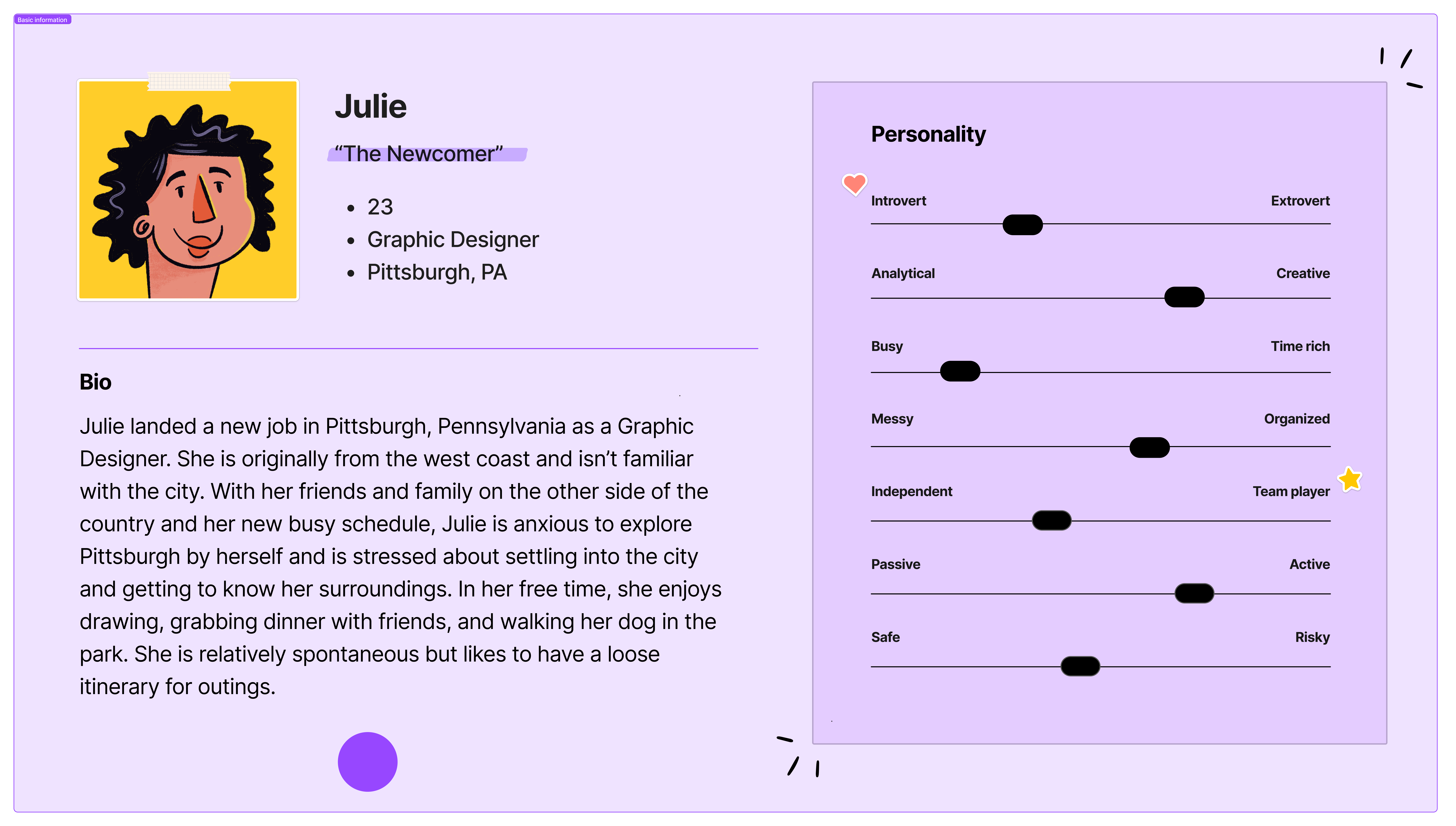
Based on the compiled findings from our interviews, we discovered two main groups of thought on solo travel and developed personas based around them.
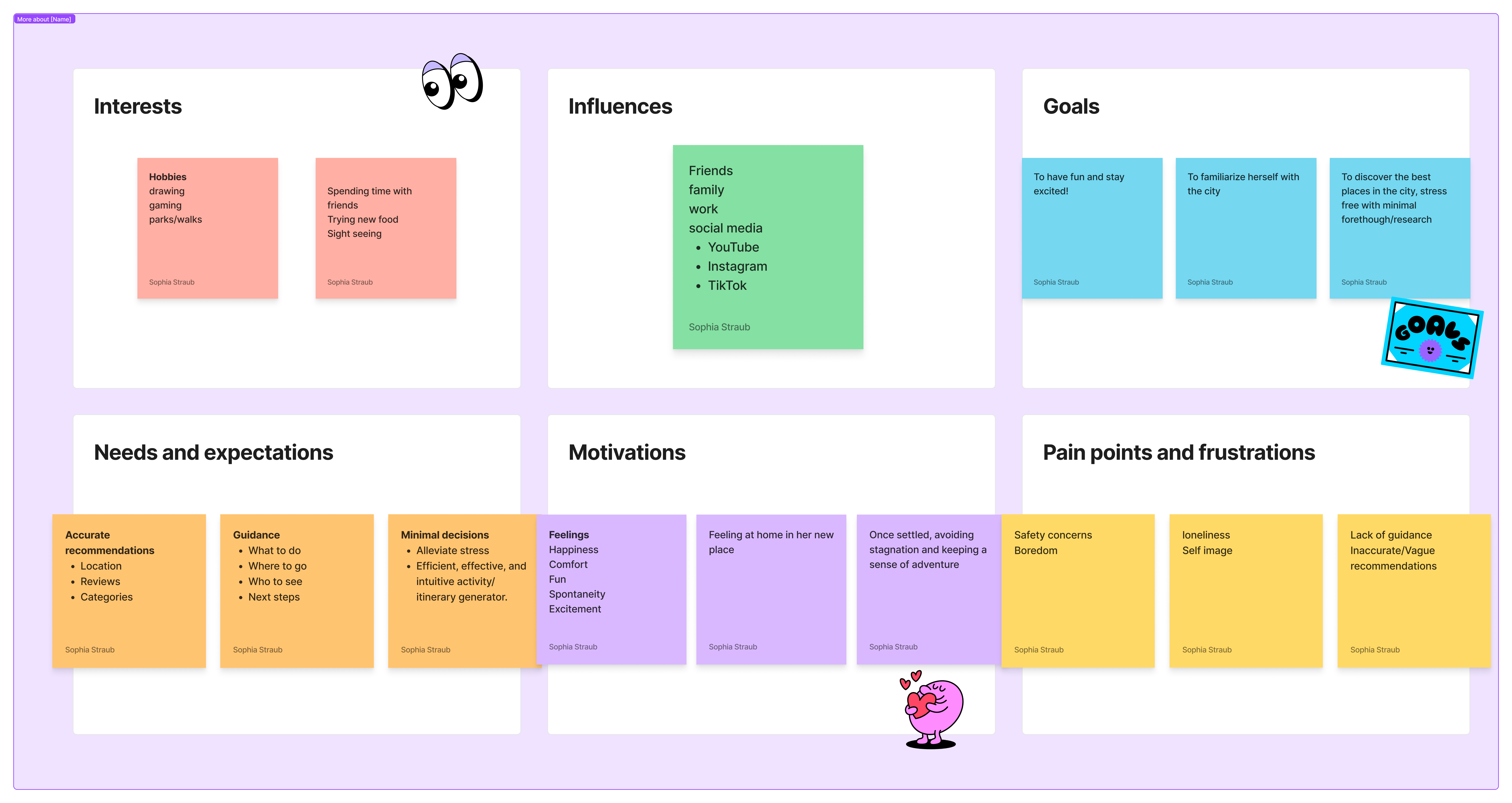
"The Newcomer"
A hesitant new city resident in need of assistance to explore her new home on her own.
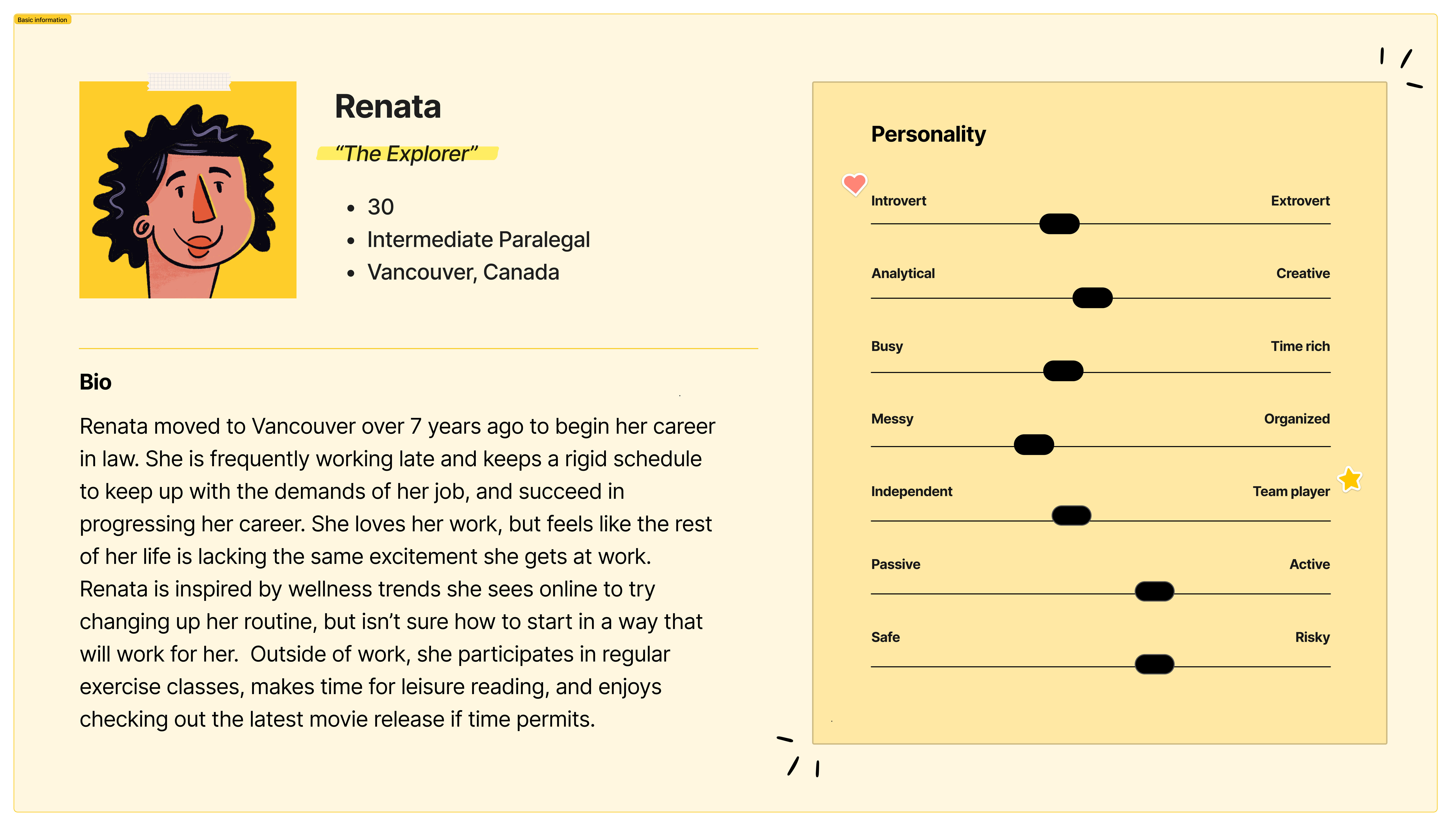
"The Explorer"
A stagnant local stuck in her usual routine looking to find excitement and discover new things about her town.
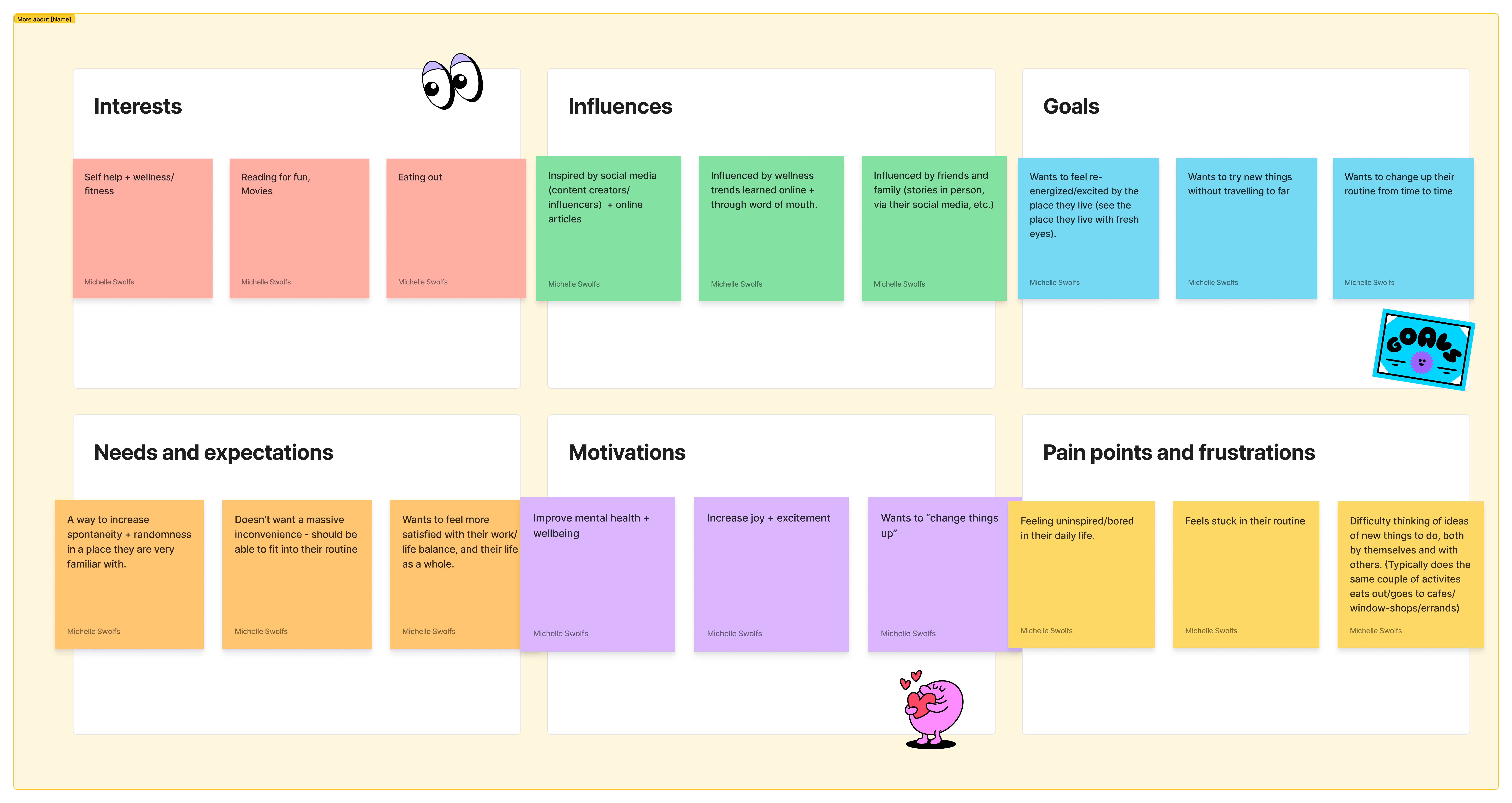
Guiding Question: How might we create excitement in familiar and unfamiliar cities alike in order to inspire an adventurous perspective for its residents?
Focus #3
Designing a Flow that Addresses the Users' Unique Problems
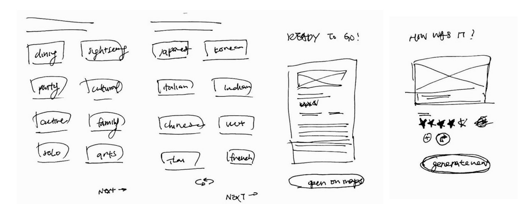
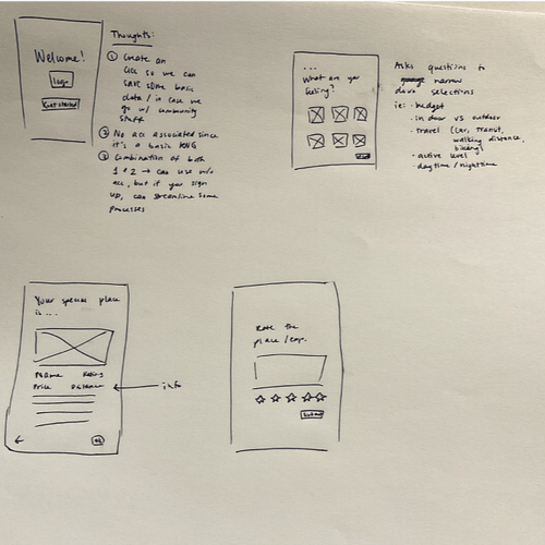
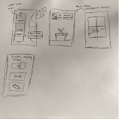
We would begin by sketching out and narrowing down our ideas. Once settled on the ones that best address our problem, we would flesh them out by creating an IA diagram of the main pages and content. After that, the wireframing and prototyping could begin.
Sketches

Favorite Features
Quiz/Assessment Feature
to narrow down recommendations
Review of the Visit Prompt
to create a feedback loop
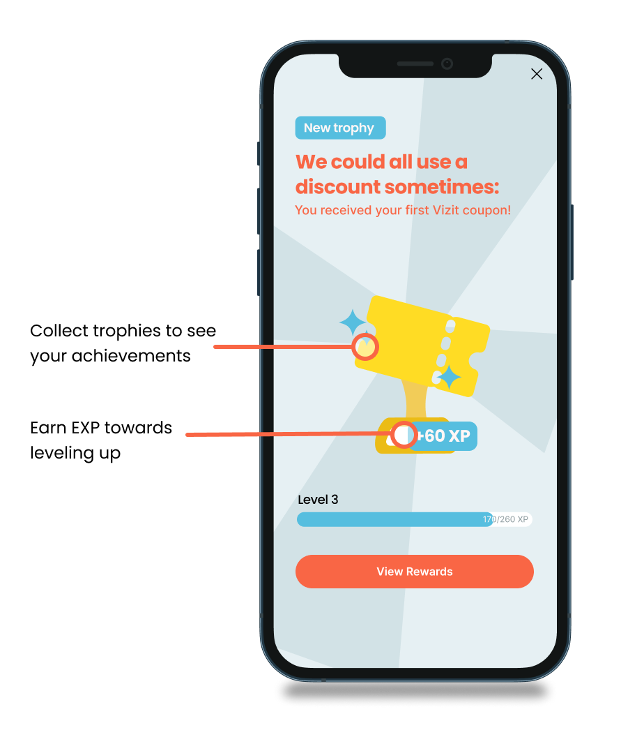
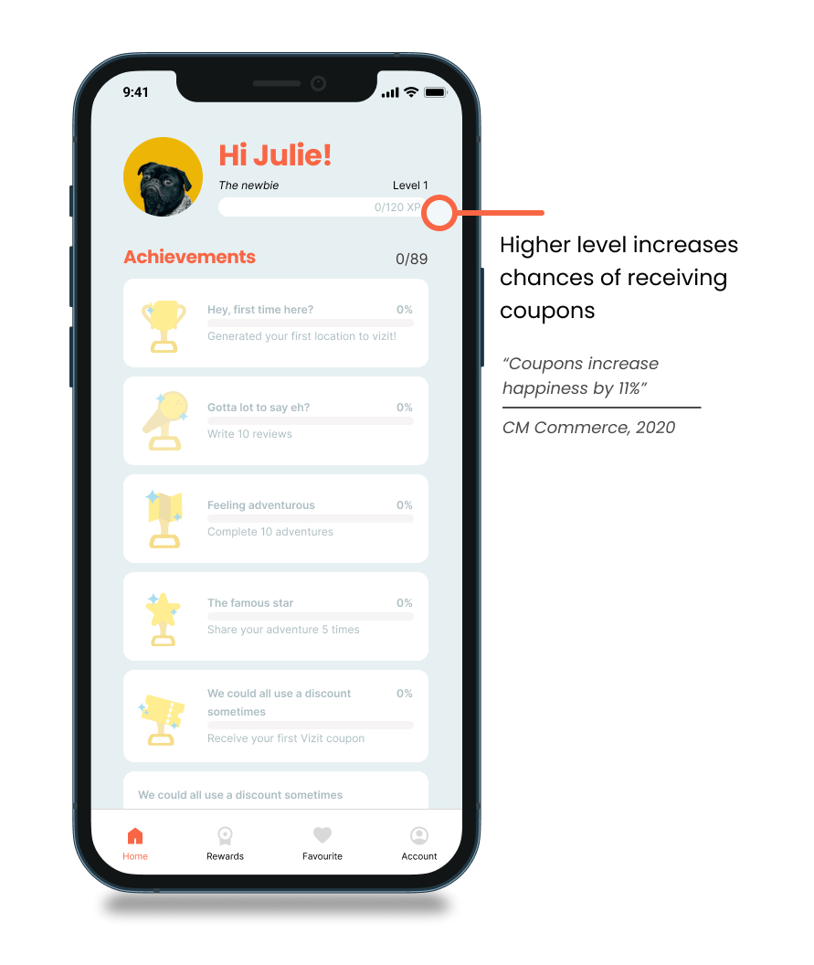
Gamification Elements
to make it engaging
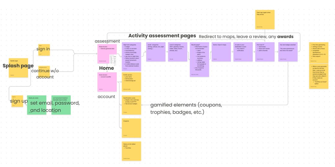
Refining the Blueprint: the Information Architecture
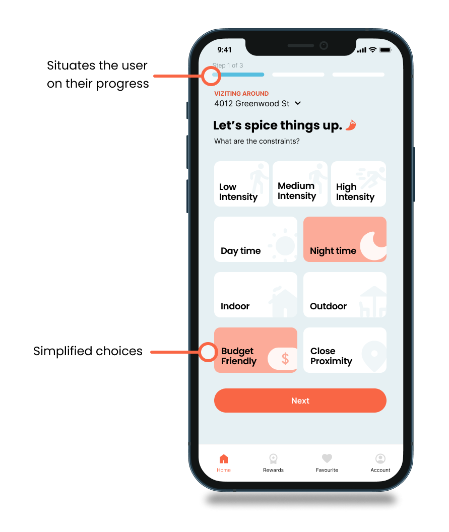
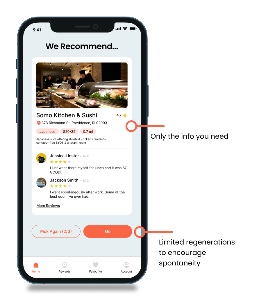
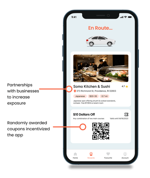
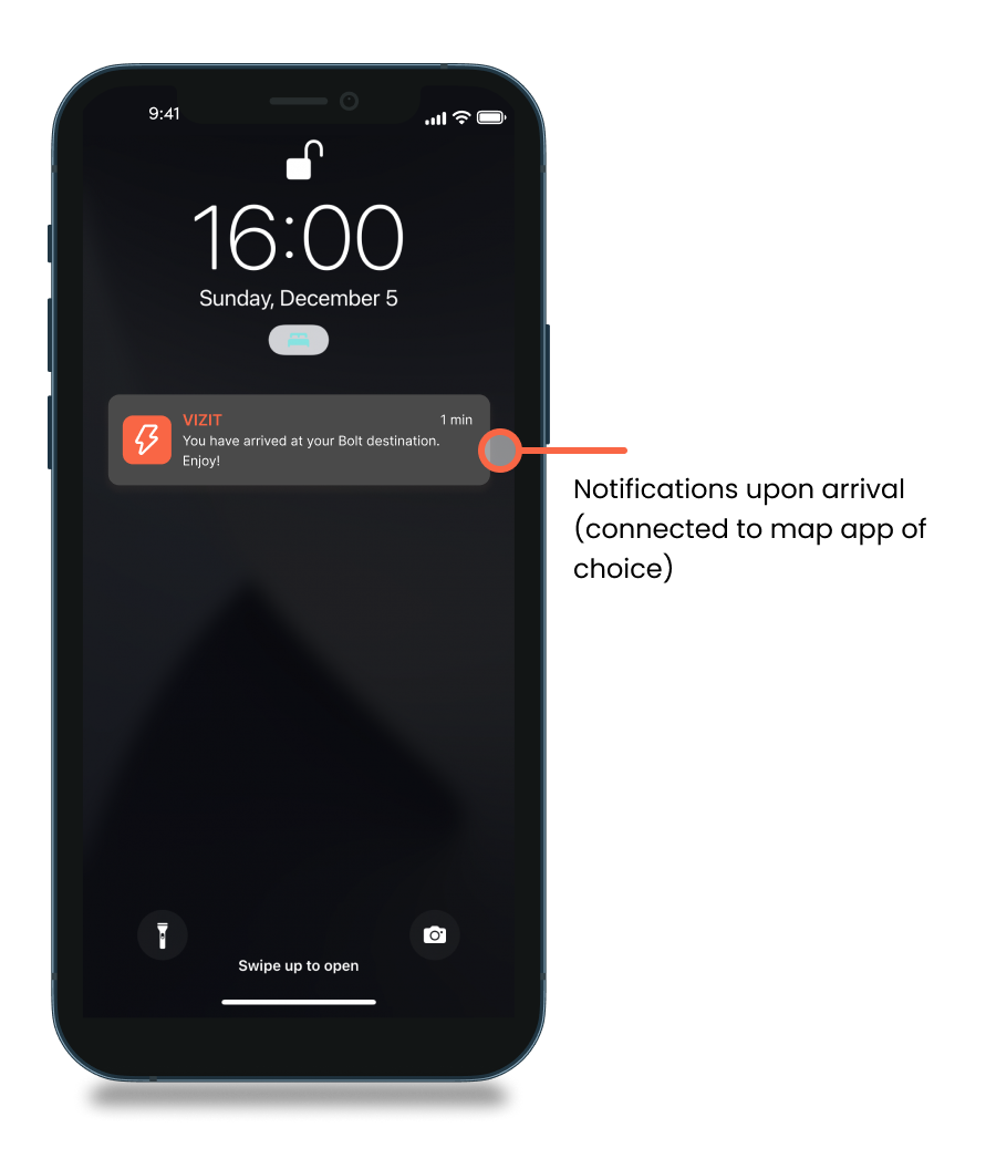
We focused on streamlining the experience and emphasizing spontaneity and lack of choice. From the homepage, the user is lead through an assessment that results in a randomly generated suggestion, concisely presented and already connected to maps.
Focus #4
Designing and Prototyping the Deliverables
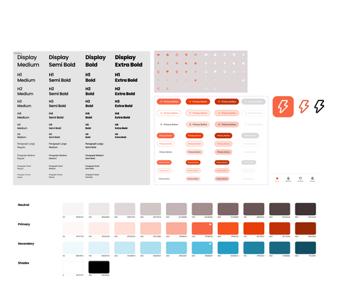
A Small Design System
We went with bright, clean, contrasting colors to convey positivity and excitement, along with sans serif fonts for added clarity and simplicity.
Submission Video
Takeaways
This was my first designation, and I learned a lot from working with my peers!
User Profiles
A user base will not always be homogeneous - in fact, it almost always isn't. While personas can be helpful to humanize the users, it is important not to oversimplify.
Finding the Balance
Considering how to integrate business and user needs (e.g. users get discounts, businesses get exposure) is a careful balance to strike. It is crucial to consider both to create a successful product.
Gamification
Gamification can be a handy tool for increasing engagement. It can transform mundane tasks into delightful experiences.
